
Overview
I’ve been on the Internet for what feels like forever, always experimenting with what I had and could do, from IRL shows to sprite animation, and now graphic design, code and livestreaming.
As I have a variety of different kinds of content to produce, I needed a new visual identity that could fit everything, and a new website that could showcase everything I do.
Goals
- Make consistent brand visuals that strike a good balance between having enough personality to be recognizable, and versatile enough so any kind of content can fit within any layout.
- Design a website that’s accessible, good-looking, animated and which is future-proof enough not to have to rewrite it a billion times again.
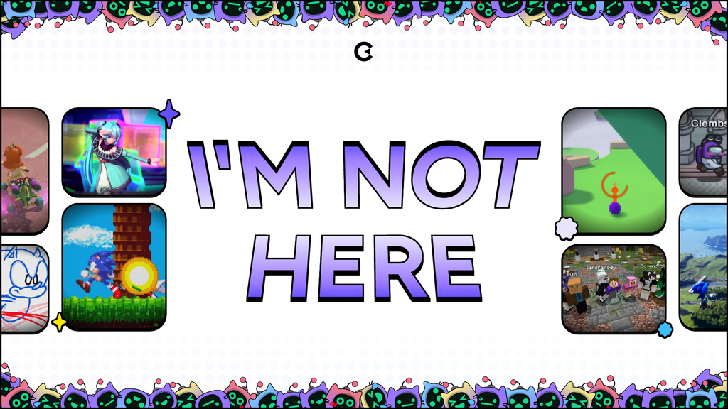
- Craft visually appealing stream overlays, screens and give Habile, my mascot, a glow up so she’s more integrated.
Logo
The logo is a fundamental element of any brand, and for my new logo, I wanted to go back to my roots while going on a more creative approach. As far as my logos got, the last one was a bit too much and ultimately was illegible and left many to wonder what it exactly was… It also looks quite odd when you compare it with the logos before it.

I’ve had the idea to take that good old “C” shape, and combine it with a pencil, which symbolizes creativity; also a tool that allows me to write (that’s the code part), and to draw (that’s the design part).
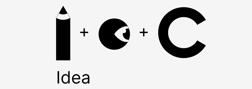
It all comes into place into this two-piece symbol that beautifully captures the creativity, sharpness and style that I am going for.
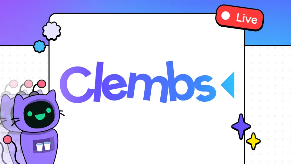
Here it is, the brand new Clembs logo!
Fundamentals
Font
For the font, I’ve settled on General Sans, which is neutral enough to fit anywhere, but has some character: it looks firm and solid, and fits beautifully in this all-outline look.
Colors
I always liked the use of color and gradients in design, and I use it very carefully not to overdo it and to let the content itself shine. For this, I’ve hierarchized colors into gradients and flat colors.
The purplue (porte-manteau of “purple” and “blue”) gradient is the one you’ll see the most throughout the brand identity. It is used to highlight certain words via their background or as the font color, and should never be mixed directly with the content or take too much space.
For controls and less visually impacting components, I mostly use pure black on top of pure white, sometimes with additional shades of gray for components with hover and pressed states, for example.
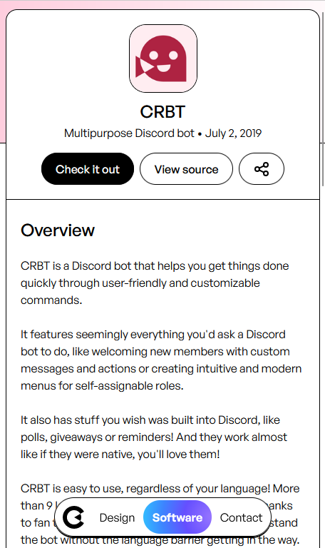
Iconography
Throughout the Clembs branding, you’ll find two sets of icons for two specific purposes:
- Standard monochrome icons:
- These elements serve for visual coherency and accessibility, mainly used on the website. For these, I’m using Tabler icons.
- Themed, colorful icons:
- Used for supportive elements on stream banners, Discord icons, and other visuals, that I make from scratch.
Stream kit
Emotes
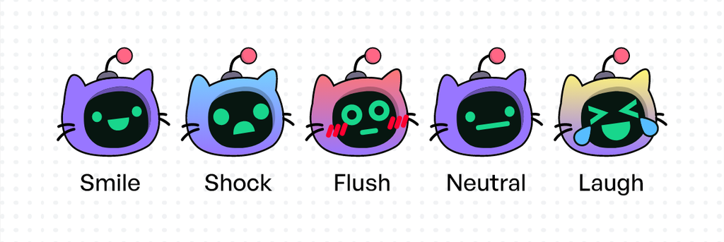
On September 2022, I achieved my goal of becoming Twitch Affiliate, which among other perks, allowed me to create static and animated emotes to insert into the live chat. I came up with a variety of emotions for Habile, my mascot, to use as alternatives to regular emojis and Twitch emotes.
Live banners
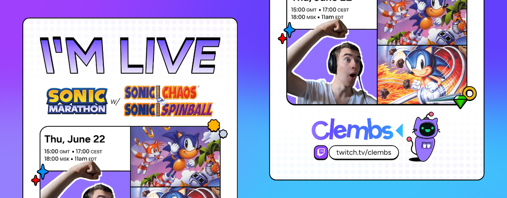
Just like any live event, you need to schedule it early to get people to be aware of it and to come. I designed these content-rich banners to promote my livestreams on Discord, which show what game(s) I will be playing, the date, some screenshots. As I have an international audience, I also wanted to show many different timezones so that groups of my channel know when it’ll be time for them, at a glance. I used GMT as it’s the standard, and CEST/MSK/EDT as a majority of my viewers are either European, Russian or American.
To indicate when I’m offline on Twitch, I also designed a banner that features many screenshots of the games I usually play. Many Habile faces are also here to reinforce the brand mascot.
Website
With a new visual identity comes a brand new website, created from scratch with SvelteKit and a lot of new techniques I gathered from years of tinkering with CSS and JavaScript. It brings all of my content together in one place, where you can easily access my new case studies, and software that I’ve released.
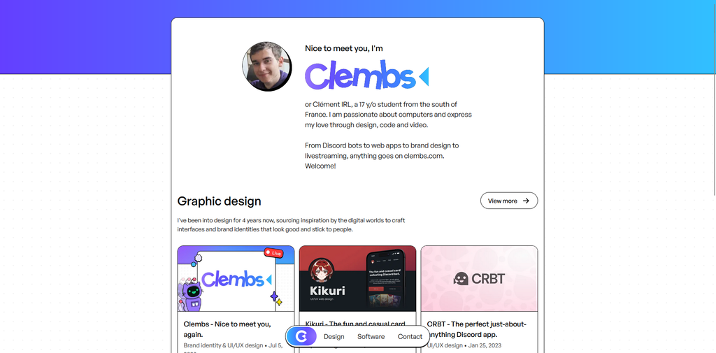
This new structure is more versatile and will allow myself to publish new content more easily and to add features over time. This is only the beginning of this website, and I’ve got so many ideas of things to bring to it!
I’ve tried to add lots of small interactions a bit everywhere, some easter eggs you don’t want to miss, and some nice and simple animations to make it nice to use.
Comments